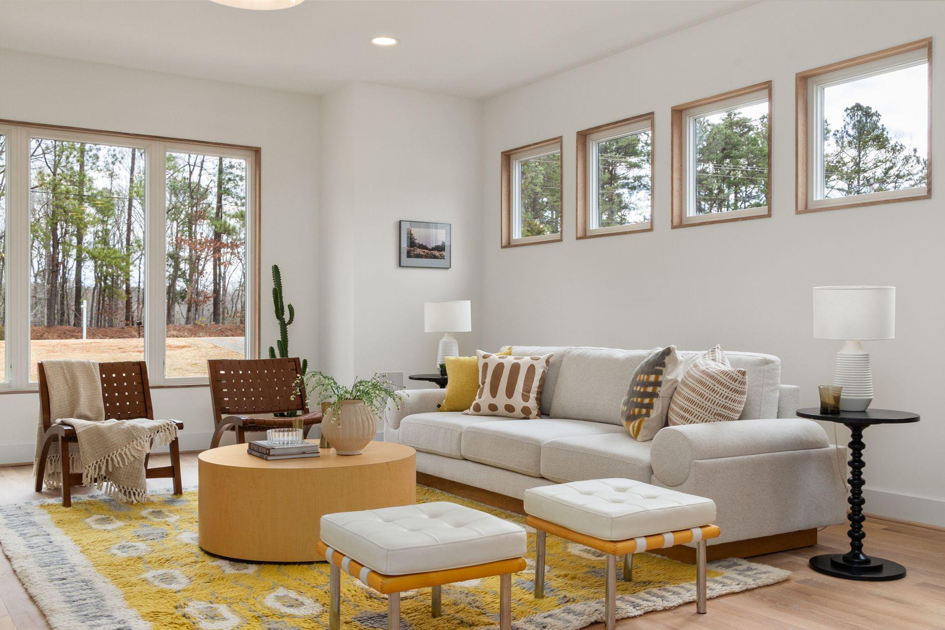
The Secret Sauce to Sophistication: Unlocking Depth with Nuanced Neutrals
I used to think neutrals were, well, boring. Beige, grey, white – seemed like a decorator’s retirement plan. But then I saw a living room, all soft creams, charcoal greys, and warm taupes, and it felt incredibly rich. It wasn’t busy, not even a little bit, but it had this tangible depth. It was like looking into a perfectly brewed cup of coffee. That’s the magic of layering neutral colors. Instead of clashing, you create a sophisticated symphony.
You can achieve this depth by playing with textures and tones. Think about a chunky knit throw in a soft ivory draped over a smooth, charcoal grey sofa. Or perhaps a linen lampshade in a muted camel casting a warm glow onto a plaster wall painted in a pale greige. It’s about variations within the neutral family. Don’t just stick to one shade of grey; use light greys, mid-tone greys, and even almost-black greys. The same applies to beiges and creams. This subtle variation is what tricks the eye into perceiving dimension.
It’s surprisingly difficult to get right, though. My biggest frustration? Overdoing it. I once tried to layer too many neutral textures in my guest bedroom and ended up with something that felt more like a forgotten linen closet than a serene retreat. The key is balance. You need anchor pieces that are perhaps a bit more solid in their color, and then you can build with lighter, more varied textures around them. A darker wood coffee table can ground a room filled with cream upholstery and light wood accents.
A great example of this done right is often seen in high-end hotel lobbies or designer showrooms. They’ll use a light, almost white, linen drapery against a slightly darker, textured neutral wall. Then, they’ll add a velvet ottoman in a deep mushroom color and perhaps a stone accent piece. It never feels overwhelming because the colors are inherently harmonious. It’s like those fancy coffee shops that use only two or three main colors but make the space feel so intentional and inviting.
Honestly, the biggest hurdle for most people is the fear of commitment. We see a pop of color online and think, “That’s exciting!” But sticking with neutrals can feel safe, perhaps too safe. What I’ve learned is that intentionality is far more impactful than a loud color. You can have a room that feels incredibly dynamic and full of personality using only shades of grey, cream, and brown, as long as you’re thoughtful about your material choices.
You might be tempted to throw in a brightly colored pillow just to “liven things up,” but I’d strongly advise against it if your goal is sophisticated depth. Instead, try a throw pillow in a neutral color but with a unique weave or pattern. Think about geometric patterns in charcoal and cream, or a subtle herringbone in taupe and beige. These elements add visual interest without introducing a jarring chromatic shift. This approach is often more sustainable in the long run, too, as neutral palettes are less likely to go out of style than trendy bright colors. For instance, according to a survey by HomeAdvisor, the average cost to paint a room can range from $300 to $800, and sticking with neutrals means you won’t be re-painting just because your teal phase is over.
The downside is that it can sometimes feel a bit… flat if you’re not careful. If you use all the same finish and texture, you’re going to end up with that busy-but-not-really-interesting look. You absolutely need that contrast in materials. Think about a smooth, lacquered black side table next to a rough, woven basket. It’s not about the color difference; it’s about the tactile difference that creates visual weight. This is similar to how people manage their finances; diversifying assets, even within similar risk profiles, can create stability. For example, understanding different investment vehicles like bonds versus stocks, both considered lower-risk than speculative investments, requires looking at their inherent properties, much like how you’d assess the texture of a rug versus a silk pillow. You can learn more about financial diversification on Investopedia.
My personal opinion? Neutral layering is the ultimate flex. It shows you have confidence and a refined eye, not that you need a neon sign to prove you’re stylish. It’s the quiet luxury of interior design. It’s like the difference between a designer handbag with a giant logo versus one with impeccable stitching and luxurious material – the latter speaks volumes more to those who truly understand quality.
You can also incorporate this idea into smaller doses. Consider your wardrobe. A crisp white button-down shirt layered under a grey cashmere sweater with black trousers is classic. It’s not revolutionary, but it’s undeniably chic. The same principles apply whether you’re decorating a mansion or a studio apartment. In fact, for smaller spaces, neutral layering can make them feel larger and more open, as opposed to being broken up by too many disparate colors. You can find helpful tips on making small spaces feel bigger on NerdWallet.
Frankly, I’m surprised more people don’t embrace this. Maybe it’s the perceived lack of excitement. But when you get it right, a room decorated with thoughtfully layered neutrals feels incredibly inviting and personal. It’s a space that whispers elegance rather than shouts it.
So, next time you’re tempted to grab the brightest paint chip, consider the subtle power of a perfectly curated palette of creams, taupes, and grays. It’s a trick that consistently fools the eye into seeing more than what’s actually there, much like how magicians use misdirection.
