The Quiet Revolution: How Beige Became the New Black
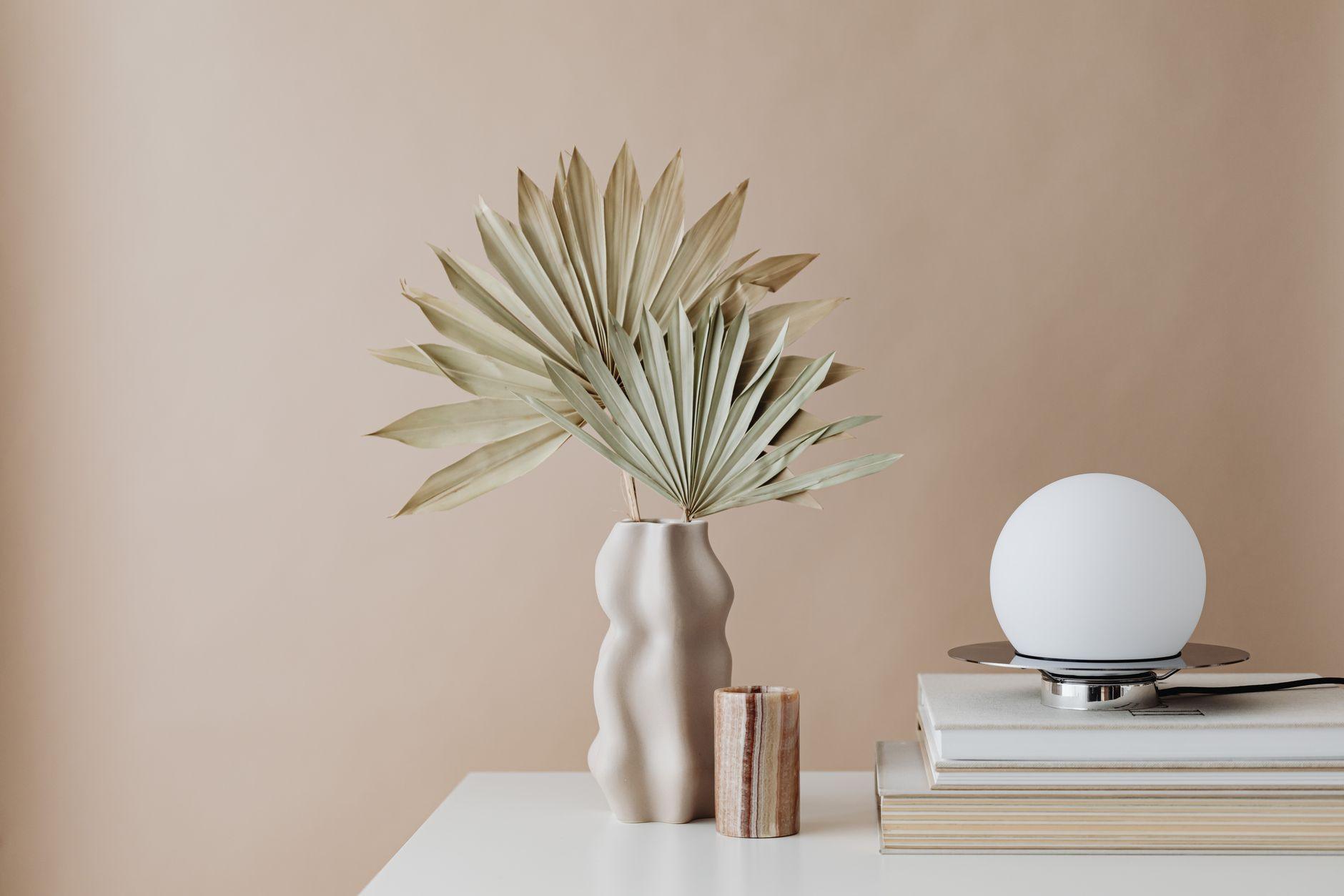
You know, I used to think a room wasn’t a room unless it was splashed with a color – bright reds, deep blues, something that screamed “look at me!” Then, about a decade ago, things started to shift. It felt like overnight, everyone I knew was trading their vibrant palettes for shades of cream, ivory, taupe, and off-white. It wasn’t just a trend; it felt like a fundamental redefinition of what “stylish” even meant. This embrace of neutral tones really became the bedrock of what we now call modern clean style.
Honestly, I was so confused at first. I’d see these minimalist spaces, all beiges and whites, and think, “Where’s the personality?” But the more I saw, the more I understood. These calm palettes weren’t devoid of character; they were creating a sense of serenity and sophistication. Think about the success of brands like Everlane or COS – their entire aesthetic is built on this foundation of understated elegance. They don’t need flashy logos or loud colors to convey quality and style. It’s all in the fabric, the cut, and yes, the neutral color scheme. It’s a deliberate choice to let form and texture take center stage.
The real beauty of neutral colors is their incredible versatility. You can use them as a blank canvas for bolder accents, or you can layer different shades of beige and grey to create depth and interest. Take the “quiet luxury” trend, for example. It’s all about investing in high-quality, timeless pieces in neutral hues that won’t go out of style. A well-made camel coat or a cashmere sweater in a soft grey will serve you for years, and they look effortlessly chic. It’s a stark contrast to fast fashion, which often relies on fleeting, vibrant color trends.
Of course, it’s not all sunshine and eggshell. My biggest gripe with living in a neutral-dominated world is the sheer potential for things to feel… well, a little boring if you’re not careful. It’s astonishingly easy to fall into the trap of creating a space or wardrobe that feels bland, even with expensive items. You really have to be intentional about incorporating different textures, varied materials, and interesting silhouettes to keep it from looking like a doctor’s waiting room. I remember trying to decorate my living room in all cream and found myself staring at a sea of sameness that honestly made me a little seasick. It took a lot of natural wood, linen throws, and black metal accents to bring it back to life.
The rise of neutral tones also ties into a broader cultural shift towards minimalism and conscious consumption. People are seeking out less clutter, fewer distractions, and a sense of calm in their lives. A neutral color palette naturally supports this. It’s about creating a peaceful environment that allows you to focus on what truly matters. For instance, in interior design, using light neutrals can make a small apartment feel much larger and more open, a trick that designers have been using for ages, according to Houzz. It’s a practical application of color psychology, making spaces feel more airy and expansive.
It’s also surprisingly easy to achieve this look on a budget. You don’t need to spend a fortune on designer beige sofas. Thrifting can yield incredible finds – a vintage oatmeal-colored cardigan or a set of stone-colored ceramic plates can be just as stylish as something from a high-end boutique. The key is to look for quality materials and classic shapes. You’ll find that many affordable retailers, like H&M or Zara, are incredibly adept at channeling this neutral-focused aesthetic these days, often with pieces that look far more expensive than they are.
However, there’s a distinct downside that gets overlooked: maintenance. White and light-colored fabrics and finishes are notorious for showing every single speck of dirt, every coffee spill, every smudge. Keeping a truly all-neutral space pristine often requires a level of vigilance that frankly, most people, myself included, don’t possess. It’s a constant battle against dust bunnies and potential stains. You’ll spend a significant amount of time cleaning, and sometimes, you just have to accept a little imperfection. This is something Investopedia notes when discussing the financial implications of certain lifestyle choices, and it absolutely applies to home decor too.
Ultimately, the dominance of neutral tones in modern clean style is a testament to our desire for simplicity, sophistication, and a sense of calm. It’s a look that’s both aspirational and achievable, offering a timeless appeal that transcends fleeting trends. It’s less about a lack of color and more about a mastery of subtlety, proving that sometimes, the most powerful statements are whispered, not shouted. This shift has made the world of design feel more accessible, yet paradoxically, it has also made it incredibly difficult to stand out when everyone is wearing the same uniform.
