Your Closet’s Secret Language: Decoding the Colors That Speak Louder Than Words
It’s funny how we think we pick our clothes based on what’s clean or what matches, but honestly, it’s often our subconscious mind, influenced by color theory, that’s calling the shots. You might grab that bright yellow sweater because you’re feeling cheerful, or opt for somber navy when you need to feel grounded. It’s not just about looking good; it’s about how those colors make you feel and how they subtly communicate without you saying a word. Think about it: a sharp red tie signals power and passion, while a pale blue shirt whispers calm and reliability. This isn’t just some artistic mumbo jumbo; it’s a deeply ingrained psychological phenomenon that affects everyone.
I remember a time I was trying to land a really important client, and I’d meticulously planned my outfit. I chose this really conservative, almost muted grey suit, thinking it would scream professionalism. I felt totally put together. But after the meeting, I found out the client’s feedback was that I seemed a bit… uninspired. I was flabbergasted! Looking back, that lack of vibrant color probably contributed more than I realized to that perception. I should have incorporated something a little bolder, maybe a contrasting pocket square or a tie with a bit more pizzazz.
The core of color theory revolves around the color wheel, a visual tool that shows the relationships between primary, secondary, and tertiary colors. Understanding how these colors interact is key to creating harmonious or impactful combinations in your wardrobe. For instance, complementary colors, those directly opposite each other on the wheel like blue and orange or red and green, create a strong contrast when paired. Wearing a cobalt blue dress with burnt orange accessories will naturally draw the eye and make a bold statement. It’s a bit like a visual handshake, grabbing attention.
Then you have analogous colors, which are next to each other on the wheel, like blues and greens. These create a more serene and cohesive look. Think of a beautiful outfit featuring a teal blouse, emerald green trousers, and maybe a seafoam scarf. It feels very natural and pleasing to the eye, like looking at a landscape. This approach is fantastic when you want to look polished and put-together without being overly flashy. It’s subtle power, if you will.
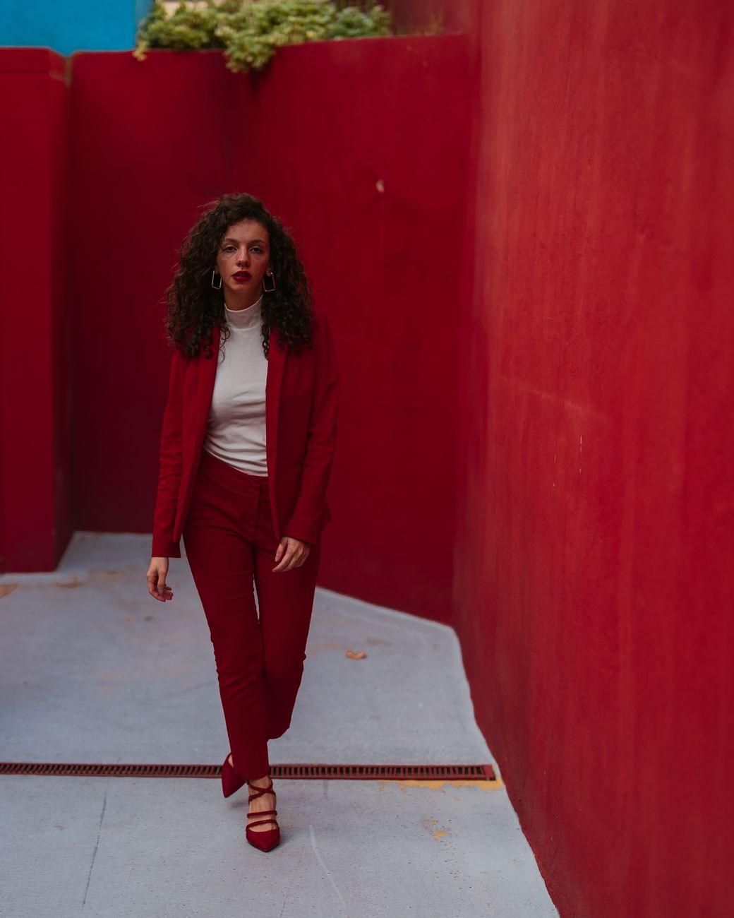
One of the biggest challenges with applying color theory practically is that it’s not always straightforward, and sometimes, personal preference throws a wrench in the works. I’ve seen people rock color combinations that, technically, shouldn’t work according to the rules, but they just do. It’s kind of frustrating, honestly! For example, I absolutely adore seeing someone in a well-executed monochromatic outfit, where everything is in shades of the same color, say various shades of pink. It can look incredibly chic and sophisticated, but getting it right without looking like a Pepto-Bismol overdose takes a keen eye. It can be easy to slip into looking a bit too matchy-matchy, which can feel dated.
Monochromatic looks are built on wearing different tints, tones, and shades of a single color. So, instead of just one solid color, you’re layering lighter and darker versions of it. This creates depth and visual interest. A fantastic example is a head-to-toe look in different shades of beige and cream, perhaps with a tan trench coat over a cream knit sweater and beige slacks. It’s elegant and elongating, making you appear taller and slimmer, a trick that’s particularly effective. These kinds of outfits are surprisingly versatile and can be dressed up or down easily, making them a go-to for many occasions.
Warm colors – reds, oranges, yellows – tend to be energetic and attention-grabbing. They can evoke feelings of warmth, happiness, and excitement. Think of a vibrant saffron dress or a fiery red jacket. These colors naturally draw attention. On the flip side, cool colors – blues, greens, purples – often convey calmness, stability, and sophistication. A lavender suit or a deep forest green skirt can feel very serene and introspective. The psychological impact of these color families is well-documented in studies, with research suggesting that warm colors can increase heart rate and energy levels, while cool colors can have a calming effect.
Now, let’s talk about neutrals. They’re the backbone of many wardrobes for a reason. Black, white, grey, brown, and beige are incredibly versatile. You can pair almost any color with a neutral. A black blazer over a bright floral dress grounds the look. A white t-shirt under a bold, patterned shirt keeps things casual. These colors are also great for building a base. Starting with neutral trousers and a neutral top gives you a blank canvas to play with bolder accessories, like a royal blue handbag or fuchsia heels. The trick is to find the right neutral undertone for your skin tone; not all whites are created equal, and the same goes for greys and beiges. This is where things get a little tricky, and it can be really frustrating when you can’t quite figure out why a certain neutral just doesn’t feel right.
The biggest hurdle for many people is the fear of making a mistake. We’re taught from a young age to “match” our clothes, and sometimes that translates into being afraid to experiment with color. But honestly, most fashion “rules” are more like guidelines. You’ll find that even unexpected color pairings can look fantastic if you commit to them. Take the pairing of pink and red, for example. Once considered a fashion faux pas, it’s now a chic and vibrant combination embraced by many designers and style icons. It’s all about the shade and saturation you choose and how you wear it with confidence.
Ultimately, understanding color theory is less about memorizing rigid rules and more about developing an intuitive sense for what looks and feels good to you. It’s a tool that empowers you to express yourself more effectively through your clothing. If you’re feeling bold, lean into those complementary colors. If you’re seeking tranquility, embrace analogous shades. Your wardrobe is your personal canvas, and color is your most powerful brush. And sometimes, the most striking statement is made by intentionally clashing everything you own.
